Note
Go to the end to download the full example code.
PCA example (iris dataset)
In this example, we perform the PCA dimensionality reduction of the classical iris
dataset (Ronald A. Fisher.
“The Use of Multiple Measurements in Taxonomic Problems. Annals of Eugenics, 7, pp.179-188, 1936).
First we laod the spectrochempy API package
import spectrochempy as scp
load a dataset from scikit-learn
dataset = scp.load_iris()
Create a PCA object
Here, the number of components wich is used by the model is automatically determined
using n_components="mle". Warning: mle cannot be used when
n_observations < n_features.
Fit dataset with the PCA model
<spectrochempy.analysis.decomposition.pca.PCA object at 0x7f6bd287b410>
The number of components found is 3:
3
It explain 99.5 % of the variance
pca.cumulative_explained_variance[-1].value
We can also specify the amount of explained variance to compute how much components are needed (a number between 0 and 1 for n_components is required to do this). we found 4 components in this case
pca = scp.PCA(n_components=0.999)
pca.fit(dataset)
pca.n_components
4
the 4 components found are in the components attribute of pca. These components are
often called loadings in PCA analysis.
Note: it is equivalently possible to use the loadings attribute of pca, which
produce the same results.
To Reduce the data to a lower dimensionality using these three components, we use the
transform methods. The results is often called scores for PCA analysis.
Again, we can also use the scores attribute to get this results
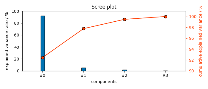
The figures of merit (explained and cumulative variance) confirm that these 4 PC’s explain 100% of the variance:
These figures of merit can also be displayed graphically
The ScreePlot
_ = pca.plot_scree()
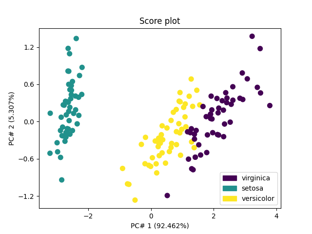
The score plots can be used for classification purposes. The first one - in 2D for the 2 first PC’s - shows that the first PC allows distinguishing Iris-setosa (score of PC#1 < -1) from other species (score of PC#1 > -1), while more PC’s are required to distinguish versicolor from viginica.
_ = pca.plot_score(color_mapping="labels")

The second one - in 3D for the 3 first PC’s - indicates that a thid PC won’t allow better distinguishing versicolor from viginica.
ax = pca.plot_score(components=(1, 2, 3), color_mapping="labels")
ax.view_init(10, 75)
This ends the example ! The following line can be uncommented if no plot shows when running the .py script with python
# scp.show()
Total running time of the script: (0 minutes 0.766 seconds)