Note
Go to the end to download the full example code.
PCA analysis example
In this example, we perform the PCA dimensionality reduction of a spectra dataset
Import the spectrochempy API package
import spectrochempy as scp
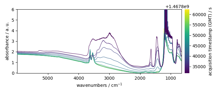
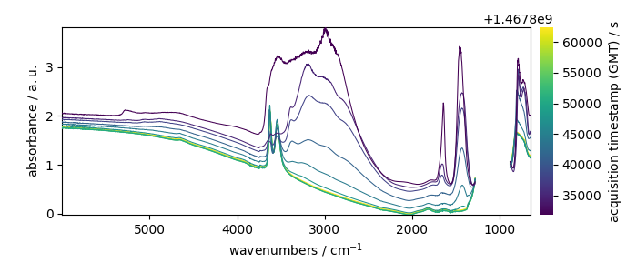
Load and inspect the dataset
dataset = scp.read_omnic("irdata/nh4y-activation.spg")[::5]
dataset
_ = dataset.plot()
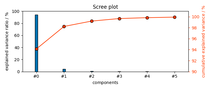
PCA on the full spectral range
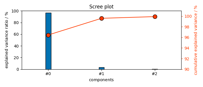
Create a PCA object and fit the dataset so that the explained variance is greater or equal to 99.9%
The number of fitted components is given by the n_components attribute (We obtain 23 components)
6
Transform the dataset to a lower dimensionality using all the fitted components
Display the results graphically
First we can set some preferences for the plot
prefs = scp.preferences
prefs.lines.markersize = 7

# ScreePlot
_ = pca.plot_scree()
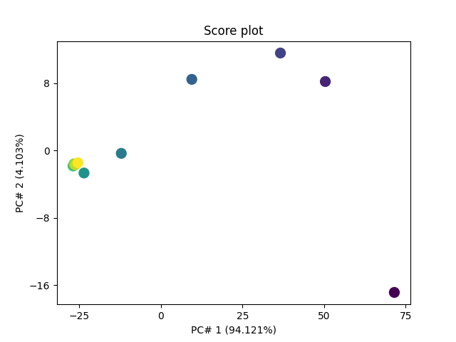
Score Plot first we can set some preferences for the plot
prefs.lines.markersize = 10

_ = pca.plot_score()

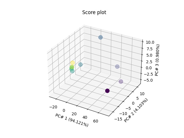
Score Plot for 3 PC’s in 3D
_ = pca.plot_score(components=(1, 2, 3))
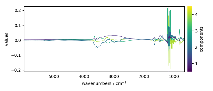
Displays 4 loadings
_ = pca.loadings[:4].plot(legend=True)
Mask the saturated region and refit
Here we do a masking of the saturated region between 882 and 1280 cm^-1
dataset[
    :, 882.0:1280.0
] = scp.MASKED  # remember: use float numbers for slicing (not integer)
_ = dataset.plot()
Apply the PCA model
3
As seen above, now only 4 components instead of 23 are necessary to 99.9% of explained variance.
_ = pca.plot_scree()
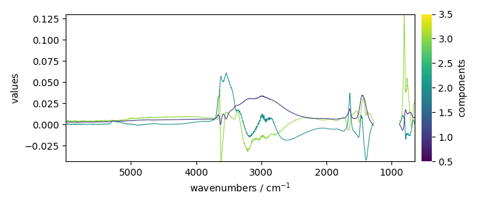
Displays the loadings
_ = pca.loadings.plot(legend=True)
Let’s plot the scores
scores = pca.transform()
_ = pca.plot_score((1, 2))

Label the score plot with custom labels
Our dataset has already two columns of labels for the spectra but there are a bit too long for display on plots.
array([[  2016-07-06 19:03:14+00:00,   vz0466.spa, Wed Jul 06 21:00:38 2016 (GMT+02:00)],
       [  2016-07-06 19:53:14+00:00,   vz0471.spa, Wed Jul 06 21:50:37 2016 (GMT+02:00)],
       ...,
       [  2016-07-07 02:43:15+00:00,   vz0512.spa, Thu Jul 07 04:40:39 2016 (GMT+02:00)],
       [  2016-07-07 03:33:17+00:00,   vz0517.spa, Thu Jul 07 05:30:41 2016 (GMT+02:00)]], shape=(11, 2), dtype=object)
So we define some short labels for each component, and add them as a third column:
labels = [lab[:6] for lab in dataset.y.labels[:, 1]]
scores.y.labels = labels  # Note this does not replace previous labels,
# but adds a column.
Display the labeled score plot
Labels are now placed automatically using the adjustText library,
which provides collision avoidance between labels and markers.
Install adjustText with pip install adjustText for best results;
without it, labels are still shown with a simple offset from markers.
_ = pca.plot_score(scores=scores, show_labels=True, labels_column=2)
This ends the example ! The following line can be uncommented if no plot shows when running the .py script with python
# scp.show()
Total running time of the script: (0 minutes 1.905 seconds)