Note
Go to the end to download the full example code.
NDDataset creation and plotting example
In this example, we create a 3D NDDataset from scratch, and then we plot one section (a 2D plane)
Creation
Now we will create a 3D NDDataset from scratch
Data
here we make use of numpy array functions to create the data for coordinates axis and the array of data
import numpy as np
As usual, we start by loading the spectrochempy library
import spectrochempy as scp
We create the data for the coordinates axis and the array of data
c0 = np.linspace(200.0, 300.0, 3)
c1 = np.linspace(0.0, 60.0, 100)
c2 = np.linspace(4000.0, 1000.0, 100)
nd_data = np.array(
    [
        np.array([np.sin(2.0 * np.pi * c2 / 4000.0) * np.exp(-y / 60) for y in c1]) * t
        for t in c0
    ]
)
Coordinates
The Coord object allow making an array of coordinates
with additional metadata such as units, labels, title, etc
Labels can be useful for instance for indexing
Coord: [float64] K (size: 1)
nd-Dataset
The NDDataset object allow making the array of data with units, etc…
mydataset = scp.NDDataset(
    nd_data, coordset=[coord0, coord1, coord2], title="Absorbance", units="absorbance"
)
mydataset.description = """Dataset example created for this tutorial.
It's a 3-D dataset (with dimensionless intensity: absorbance )"""
mydataset.name = "An example from scratch"
mydataset.author = "Blake and Mortimer"
print(mydataset)
NDDataset: [float64] a.u. (shape: (z:3, y:100, x:100))
In a Jupyter notebook, the NDDataset is displayed as follows (click on the arrow on the left to expand the metadata):
We want to plot a section of this 3D NDDataset:
NDDataset can be sliced like conventional numpy-array…
or maybe more conveniently in this case, using an axis labels:
To plot a dataset, use the plot method (generic plot).
As the section NDDataset is 2D, a lines plot is displayed by default. As you can see, the x-axis is in wavenumber
and the ordinate axis is in absorbance. Note that in this case, the default NDDataset.plot() command is equivalent to
plot_lines().
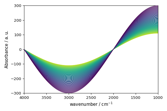
Note also that a colormap (‘viridis’) has been automatically set for the lines. This is because the y-dimension of the dataset has float coordinates (they correspond to a time). In such a case tt is easy to add a colorbar expliciting the colors <-> time value correspondance:
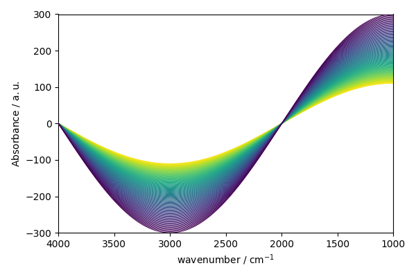
If the y-dimension had no coordinates or consecutive integer coordinates starting by 0`or `1, a categorical
color map would have been chosen. The default behavior can be overriden by explictly passing a colomap. For instance,
if we want to use a categorical colormap instead of a sequential one, we can do:
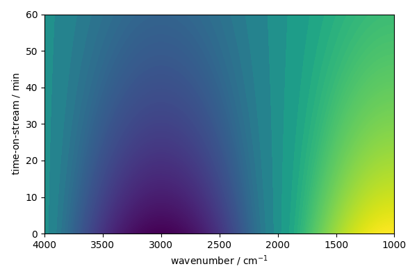
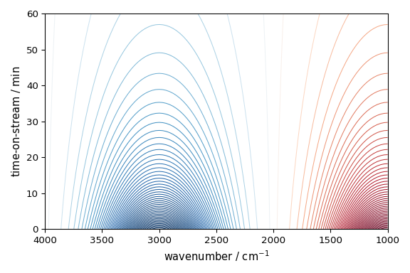
But it is possible to display image plot instead (note that the x-axis is in wavenumber and the y-axis is in time-on-stream)
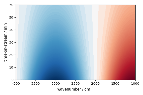
or contour plot (note that
This ends the example ! The following line can be uncommented if no plot shows when running the .py script with python
# scp.show()
Total running time of the script: (0 minutes 1.095 seconds)