Plot Types
SpectroChemPy provides several plotting methods. ds.plot() chooses automatically, but explicit methods give you control.
ds.plot() uses the default geometry for the dataset dimensionality. Use the explicit helpers below when you want the intended rendering to be obvious from the code itself.
Line Plot
For spectra and time-series:
[1]:
import os
from pathlib import Path

import spectrochempy as scp

TEST_FILE = Path(os.environ.get("TEST_FILE", "irdata/nh4y-activation.spg"))

ds = scp.read(TEST_FILE)
ds = ds[:, 4000.0:650.0]  # We keep only the region that we want to display
ds.y -= ds.y[0]  # Set y coordinates as relative time  for better visualization
ds.y.ito("hour")
ds.y.title = "Time on stream"  # Update y-axis title accordingly
ds[:, 1290.0:920.0] = scp.MASKED  # We also mask a region that we do not want to display
ds1 = ds[0]  # Single spectrum
[2]:
_ = ds1.plot()
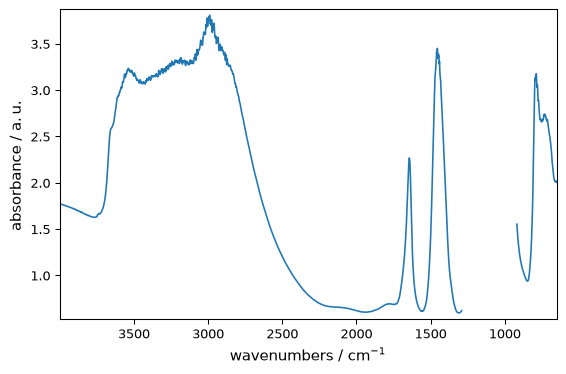
The explicit 1D helpers are:
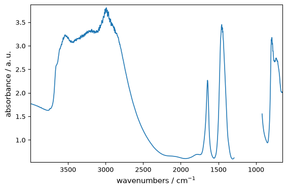
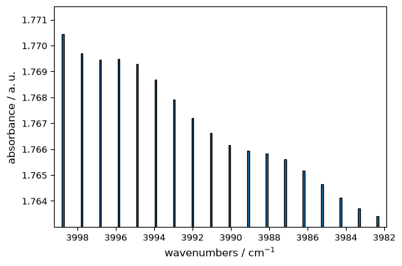
plot_pen()for line plots,plot_scatter()for marker-based plots,plot_bar()for bar charts.
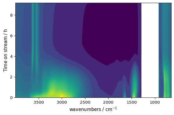
scatter=True is still accepted for compatibility, but plot_scatter() or method="scatter" is clearer in new code.
[3]:
_ = ds1.plot_pen()
[4]:
_ = ds1.plot_scatter(ms=5)
[5]:
_ = ds1[:20].plot_bar()
Or using plot_lines() explicitly (canonical form):
[6]:
_ = ds.plot_lines()
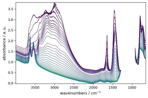
Image Plot
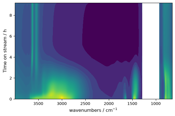
For 2D data where both axes are numerical:
[7]:
_ = ds.plot_image()
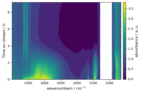
Request a colorbar when you want the intensity scale to be explicit:
[8]:
_ = ds.plot_image(colorbar=True)
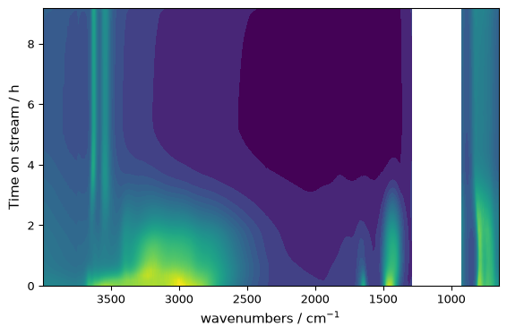
Hide the colorbar if needed:
[9]:
_ = ds.plot_image(colorbar=False)
Contour Plot
For continuous data with smooth transitions:
[10]:
_ = ds.plot_contour()
Contour plots also support colorbars:
[11]:
_ = ds.plot_contour(colorbar=True)
Filled Contour / Image-like Plot
For image-like filled rendering, use plot_contourf() or plot_image():
[12]:
_ = ds.plot_contourf(colorbar=True)
Decision Guide
Method |
Use When |
|---|---|
|
Showing spectra, time series, or stacked traces |
|
Explicit 1D line, marker, or bar rendering |
|
2D field with spatial x/y axes |
|
Smooth visualization of continuous 2D data |
|
Filled, image-like contour rendering |
|
3D perspective view of 2D data |
|
3D-style waterfall representation |
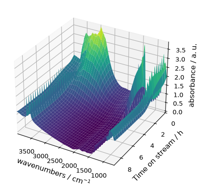
Surface Plot
For a 3D perspective view of 2D data:
[13]:
_ = ds.plot_surface(y_reverse=True, linewidth=0)
Waterfall Plot
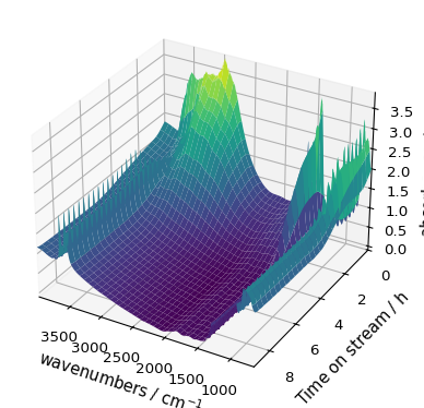
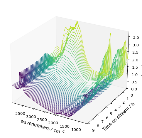
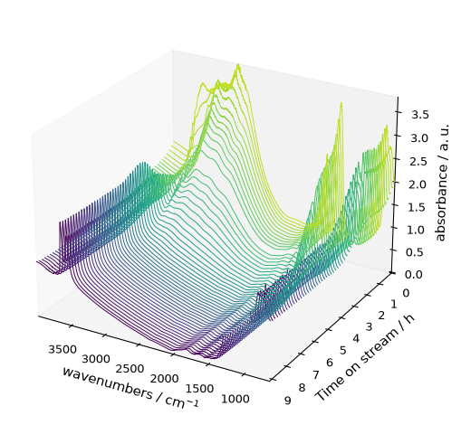
For a waterfall-style representation:
[14]:
_ = ds.plot_waterfall(y_reverse=True, figsize=(6, 5))
Overlay Several Datasets on One Axes
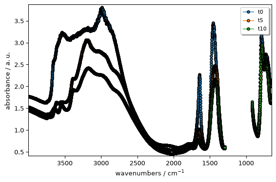
plot_multiple() overlays several 1D datasets on the same Matplotlib axes. Use it when you want one shared set of axes and one combined legend.
[15]:
datasets = [ds[0], ds[5], ds[10]]
_ = scp.plot_multiple(
    datasets,
    method="scatter",
    labels=["t0", "t5", "t10"],
    legend="best",
    ms=4,
)
Arrange Several Datasets on a Grid
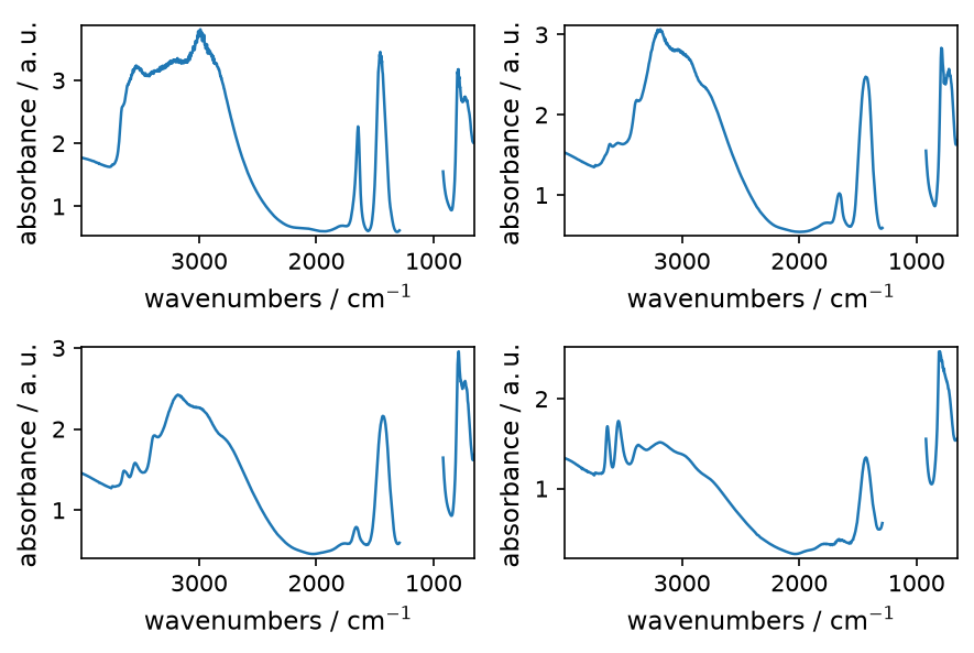
multiplot() creates a grid of axes. Use it when each dataset should keep its own panel rather than being overlaid.
[16]:
_ = scp.multiplot([ds[0], ds[5], ds[10], ds[15]], nrows=2, ncols=2, method="pen")
Combining with Options
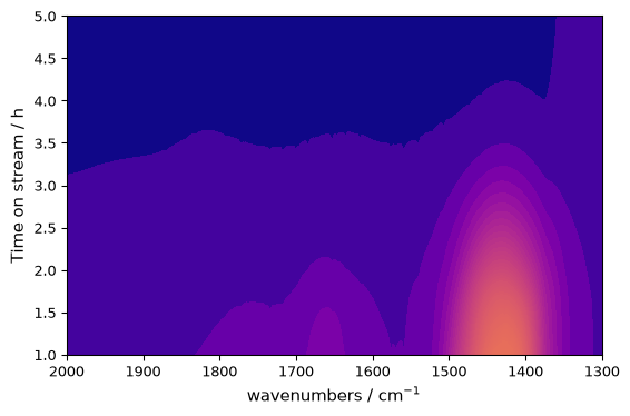
All plot methods accept the same customization options:
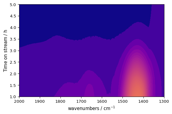
[17]:
_ = ds.plot_image(
    cmap="plasma",
    xlim=(2000, 1300),
    ylim=(1, 5),
)
The appropriate method is chosen automatically when you call ds.plot(), but explicit methods make your intent clear and provide specific functionality.
Deprecated Method Names
The following legacy names still work, but the canonical names are preferred for new code:
Legacy name |
Preferred name |
|---|---|
|
|
|
|
|
|
plot_image() remains a supported explicit helper for image-style plotting, so choose between plot_image() and plot_contourf() based on which name makes your intent clearer.